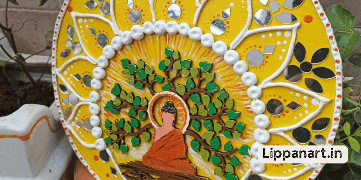
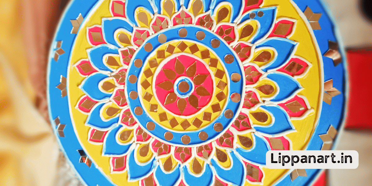
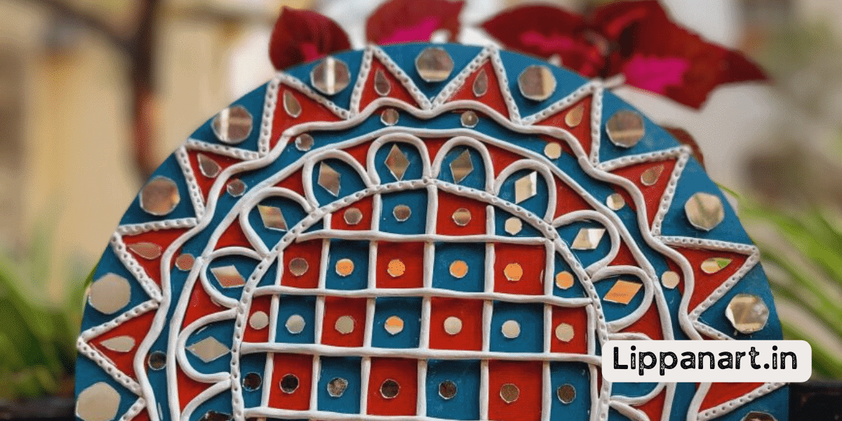
You may be thinking, ‘What is lippan art and why should I care about the colors I use?’
Lippan art is a traditional folk art from India that uses a combination of clay, glass, and mirrors to create stunning designs.
By understanding the basics of lippan art and the psychology behind colour choices, you can create stunning art that conveys a deeper meaning to your audience.
Let’s explore the modern lippan art colour guide together!
Understanding the Basics of Lippan Art
Understanding the basics of Lippan art is key to creating beautiful, vibrant pieces. It is an ancient form of Indian folk art, traditionally used to decorate homes and temples.
Practising the techniques of Lippan art, such as spreading a mixture of limestone and gum arabic over a flat surface, is essential to a successful composition. Adding layers of colour and creating depth through different hues, shades, and tones is also important.
Incorporating texture by exploring different patterns and lines will further enrich the piece. Finally, understanding the symbolism of the imagery and how it reflects the culture and traditions of the artist will help create an aesthetically pleasing work of art.
With practice and dedication, anyone can produce stunning Lippan artwork with bold colours and intricate designs.
Colour Psychology and How It Affects Your Art
Exploring the psychology of colour in your work can dramatically affect its overall impact. Colour plays an important role in artistic expression and cultural symbolism, and understanding the nuances of hue selection can help create an emotional impact in your lippan art.
Colour symbolism can be used to create a vivid narrative while also stimulating the senses and adding a layer of complexity to your work.
Here are some key elements to consider when selecting colours for your lippan art:
- Research the cultural symbolism of the colours you plan to use so that your audience can appreciate the deeper meaning behind your art.
- Pay attention to the emotional impact of the colours you choose, as this can make or break the success of your artwork.
- Understand how the combination of colours affects your piece’s overall look and feel, and experiment with different hues to achieve the desired effect.
Using colour psychology in your lippan art can take your work to the next level, providing an enriching and meaningful experience for both you and your viewers. By being patient and trying different techniques, it’s possible to craft a stunning work of art that will capture attention and ignite inspiration.
Choosing the Right Color Combinations
Choosing the right colour combinations for your artwork can be tricky, but with a little practice, you can create stunning visuals that evoke emotion and tell a story. Start by understanding the basics of colour mixing. One can create additional colours by mixing the primary colours of red, blue, and yellow. Once you understand how colours mix, you can experiment with colour trends and harmonies to create custom colours. Colour blocking is another great way to create interesting and unique colour combinations.
| Colours | Effect |
|---|---|
| Red | Passion |
| Blue | Serenity |
| Yellow | Joy |
| Green | Calm |
| Orange | Warmth |
| Purple | Mystery |
Mixing colours can be a fun and creative process. With a little practice, you can find the perfect combination to evoke certain emotions and tell your story. Explore colour combinations and trends to stay up-to-date, and experiment with custom colours to create a unique look. Try to think outside the box and create something that stands out!
- Editor’s Choice
- Best Seller
- Amazon Choice
Utilizing the Color Wheel for Inspiration
Using the colour wheel for inspiration can help create beautiful, eye-catching colour combinations. Understanding the basics of the colour wheel can help you create unique and vibrant works of art. Here are some tips to help you get started:
- Make use of warm tones and cool tones to create a pleasing contrast.
- Take note of the different shades of colour that can be created by mixing two or more colours.
- Look out for the latest colour trends and experiment with different vibrant shades.
Monochromatic Color Schemes
Try creating a stunning visual effect with a monochromatic colour scheme! Monochromatic colours can create a range of effects for modern lippan art.
Consider the materials and textures you are working with to achieve the desired effect when selecting colours. Experimenting with different hues and shades within the same colour family can create interesting combinations. Layering the colours can also be used to create texture and depth.
Exploring different combinations of colours is a great way to bring life to your artwork. When selecting the colours for your project, think about the tones you want to achieve and the mood you want to create. Using a monochromatic colour scheme, you can find the perfect combination that is visually and emotionally satisfying.
Have fun with it, and be bold and experiment with different hues and shades. With creativity and a focus on details, you can craft a unique and visually appealing item.
Complementary Colors
Complementary colours are a great way to instantly create a vibrant and impactful look in your artwork. Combining two colours opposite each other on the colour wheel can create colour harmony and bring a sense of balance to your lippan art.
Creating depth with colour can be achieved by mixing and matching tints and shades and using colour blocking to create visually appealing designs. Highlighting techniques can also make certain elements in your artwork stand out and draw the viewer’s eye.
With complementary colours, you can create an eye-catching piece that will be remembered for years.
- Editor’s Choice
- Best Seller
- Amazon Choice
Analogous Colors
Analogous colours are a great way to create a calming atmosphere in your designs. They’re a group of colours next to each other on the colour wheel and often work well together to create a beautiful and harmonious effect. When mixing colours, you can use brush techniques like wet-on-wet or dry-on-dry. Colour theory can help you decide which colours to mix. Art materials like pastels, gouache, watercolours, and acrylics can be used to create depth.
| Mixing Colors | Brush Techniques |
|---|---|
| Blending | Glazing |
| Shading | Lifting |
| Overlaying | Stippling |
| Colour Theory | Art Materials |
|---|---|
| Colour Schemes | Watercolours |
| Colour Mixing | Acrylics |
| Colour Harmonies | Pastels |
| Colour Tints | Gouache |
Triadic Colors
Triadic colours are a great way to create a bold design look. They’re a group of three colours evenly spaced on the colour wheel and often work well together to produce a striking contrast. Exploring pigment sources is essential for creating vibrant shades, as is layering colours, hues, and tints.
Contrast and blending techniques are important for achieving the desired impact of your modern lippan art colour guide. Here are four ways to use triadic colours to create a beautiful piece:
- Mix and match the three colours to create new shades
- Select a dominant colour and use the other two to add highlights
- Balance the colours by using shades of one colour and hues of another
- Use the three colours to create a harmonious blend of shades and tints
Split-Complementary Colors
Split-complementary colours are a great way to achieve a bold look in your designs, combining two colours adjacent to the base colours opposite on the colour wheel. Harmonizing colours, creating contrast, blending shades, accentuating tones, and selecting hues are all important when picking the perfect split-complementary colours for your modern lippan art.
The following table provides a few examples of split-complementary colour combinations that you can use to create a unique and exciting look for your art:
| Colour 1 | Colour 2 | Colour 3 |
|---|---|---|
| Blue | Orange | Red |
| Green | Purple | Yellow |
| Brown | Pink | Cyan |
When selecting your split-complementary colours, it is important to consider the connotation of the colours you choose. Blues and greens often symbolize nature, while oranges and reds can indicate passion and energy. Consider the message you hope to convey in your artwork and select split-complementary colours that best represent that.
For a more subtle look, consider using lighter shades of your chosen colours. This will help blend the colours and draw attention to the accent colours without overpowering the main colour. Additionally, adding a neutral colour, like white or grey, can help to bring out the other colours and create an interesting and visually appealing design.
- Editor’s Choice
- Best Seller
- Amazon Choice
Tetradic Colors
Tetradic colours are a great way to add depth and complexity to any design. They involve combining four colours that form two complementary colour pairs. This colour scheme can be particularly useful when experimenting with lippan art. By using tetradic colours, you can create interesting and unique patterns.
You can play with the four colours with textures, shapes, and materials. This allows you to create a visually stimulating piece of art. You can also explore colour symbolism and contrast by combining the four colours in various ways.
To achieve the best results with tetradic colours, it’s recommended to use bright, bold colours. These colours create contrast and can be used to create various effects. Create a lively and energetic appearance by combining various colours.
Frequently Asked Questions
What materials are best to use for Lippan Art?
For lippan art, using acrylic paints, pigment powders, and experimenting with colour mixing are great ways to start. Consider wall placement and storage solutions too. Get creative and use your knowledge to create something beautiful.
Are there any special techniques I need to know for creating Lippan Art?
You’ll discover the art of lippan is a creative adventure! Everything must be considered, from mixing colours to pigment types to colour selection and wall preparation. Framing techniques also play an important role. It’s a journey of discovery that’s sure to reward you with a stunning result!
What is the best way to hang Lippan Art?
For the best way to hang lippan art, consider colour selection, framing tips, wall design, embellishment ideas and adhesive choices. Create a stylish display with careful attention to detail. Use quality adhesives for secure mounting and incorporate creative embellishments to capture your unique vision.
How do I protect my Lippan Art from fading?
Wow! Preserving your lippan art’s vibrant hues is almost like a work of art! Selecting the right colours, proper storage, and sealing techniques will preserve your masterpiece’s colours for eternity. If you take good care of your lippan art, it will remain as vibrant and beautiful as the day you first displayed it.
What is the best way to clean and maintain Lippan Art?
To clean and maintain your lippan art, choose hues that enhance colours and preserve vibrancy. Avoid damage by protecting surfaces while cleaning. Use gentle products to preserve the artwork and prevent fading. Doing this will help keep your lippan art looking great!


